Hi there! I’m writing this blog post as part of a class assignment on accessibility in instructional design. At first, I approached the project with a checklist mentality, identifying the issues, fixing them, and submitting. Somewhere along the way, I came to understand that accessible design isn’t just about meeting standards; it’s about ensuring every learner, regardless of ability, can engage fully with the content we create. That mindset shift has been the most valuable part of this assignment.
📖 Making Content Truly Accessible
Creating accessible content isn’t just a technical requirement, it’s a moral and educational imperative. Instructional designers play a key role in removing barriers that prevent equitable access to learning materials. For this assignment, I revised a short simulated learning object titled Orchards and Vineyards. While it seemed simple at first glance, the original document had several accessibility issues, including improper headings, poor contrast, and vague image descriptions. Below, I’ll walk you through what I found, what I changed, and what I learned and will apply in my own writing in the future.
🌱 Why Accessibility Matters
Accessibility ensures that everyone including those using screen readers or other assistive tools can navigate and understand digital content. As Al-Azawei, Serenelli, and Lundqvist (2017) explain, Universal Design for Learning (UDL) encourages us to create flexible, inclusive content that supports diverse cognitive, sensory, and physical needs. Something as common as a Word document can create obstacles if it isn’t intentionally designed, especially since it’s often used as a base for PDFs or web content (W3C, 2018).
🔍 Before and After: Fixing the Barriers
Here’s a quick look at what I encountered in the original learning object, and the changes I made:
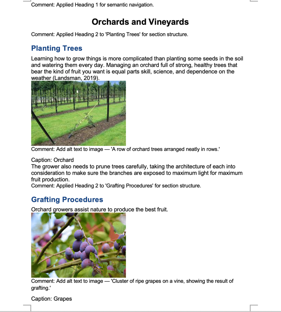
Screenshots showing red-colored text, basic headings, and an unlinked raw URL.
- Headings Not Tagged
I used Word’s built-in Heading styles, Heading 1 for the main title, Heading 2 for section titles like “Planting Trees.” This helps screen readers recognize the document’s structure and makes navigation easier.
- Missing Alt Text
The original captions simply said things like “Orchard” or “Grapes.” I added meaningful alt text like “A row of orchard trees arranged neatly in rows” and “Cluster of ripe grapes on a vine, showing the result of grafting.” This gives non-sighted users context and imagery.
- Inaccessible Links
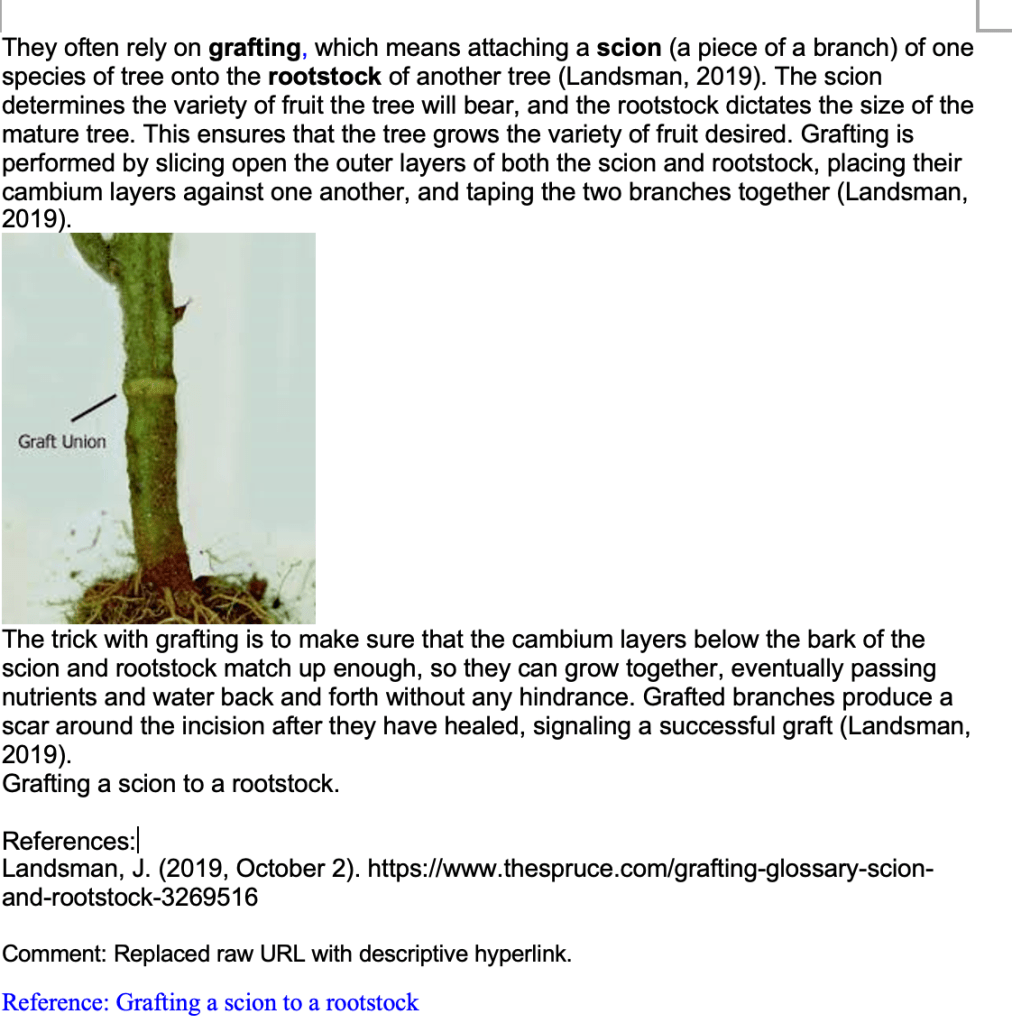
The reference section included a raw URL, which wasn’t clickable or descriptive. I updated it to a properly hyperlinked, descriptive phrase:
Grafting a scion to a rootstock.
- Color-Only Emphasis
Important terms like grafting, scion, and rootstock were shown in red, but that’s not helpful for users with color vision impairments. I swapped color emphasis for bold formatting, which preserves meaning and clarity.
- Dense Paragraphs for Instructions
The grafting process was buried in a paragraph. I suggested formatting it as a numbered list to improve clarity and readability for both sighted users and screen readers.
- Captions Misused
The image captions weren’t tagged correctly. I recommended applying Word’s “Caption” style and embedding alt text into the image properties to ensure assistive technologies can detect them.
Screenshots showing revised headings, descriptive comments, and image alt text suggestions.
🧰 Tools That Helped
These tools made the accessibility review process much easier and more informative:
- Microsoft Word Accessibility Checker
Identifies errors, warnings, and offers tips for fixing them within the Word environment.
- WAVE Web Accessibility Evaluation Tool
Provides a visual analysis of content and flags contrast, heading levels, and structure.
- WCAG 2.1 POUR Principles
A helpful framework for ensuring content is Perceivable, Operable, Understandable, and Robust (W3C, 2018).
🎯 Final Thoughts
This assignment started out as a box to check, but it became something more meaningful. I now see accessibility as a creative and compassionate part of instructional design, not just a technical requirement. It’s amazing how just a few thoughtful changes such as adding alt text, tagging headings properly, or choosing readable formatting can open the door for someone else to fully participate in the learning experience.
As I continue developing my skills as an educator and instructional designer, accessibility will remain at the forefront of my work. Because at the end of the day, good design isn’t just about what looks nice, it’s about what works for everyone.
📚 References
Al-Azawei, A., Serenelli, F., & Lundqvist, K. (2017). Universal Design for Learning (UDL): A content analysis of peer-reviewed journal papers from 2012 to 2015. Journal of the Scholarship of Teaching and Learning, 17(3), 67–84. https://doi.org/10.14434/josotl.v17i3.22102
World Wide Web Consortium (W3C). (2018). Web Content Accessibility Guidelines (WCAG) 2.1. https://www.w3.org/TR/WCAG21/

Leave a comment